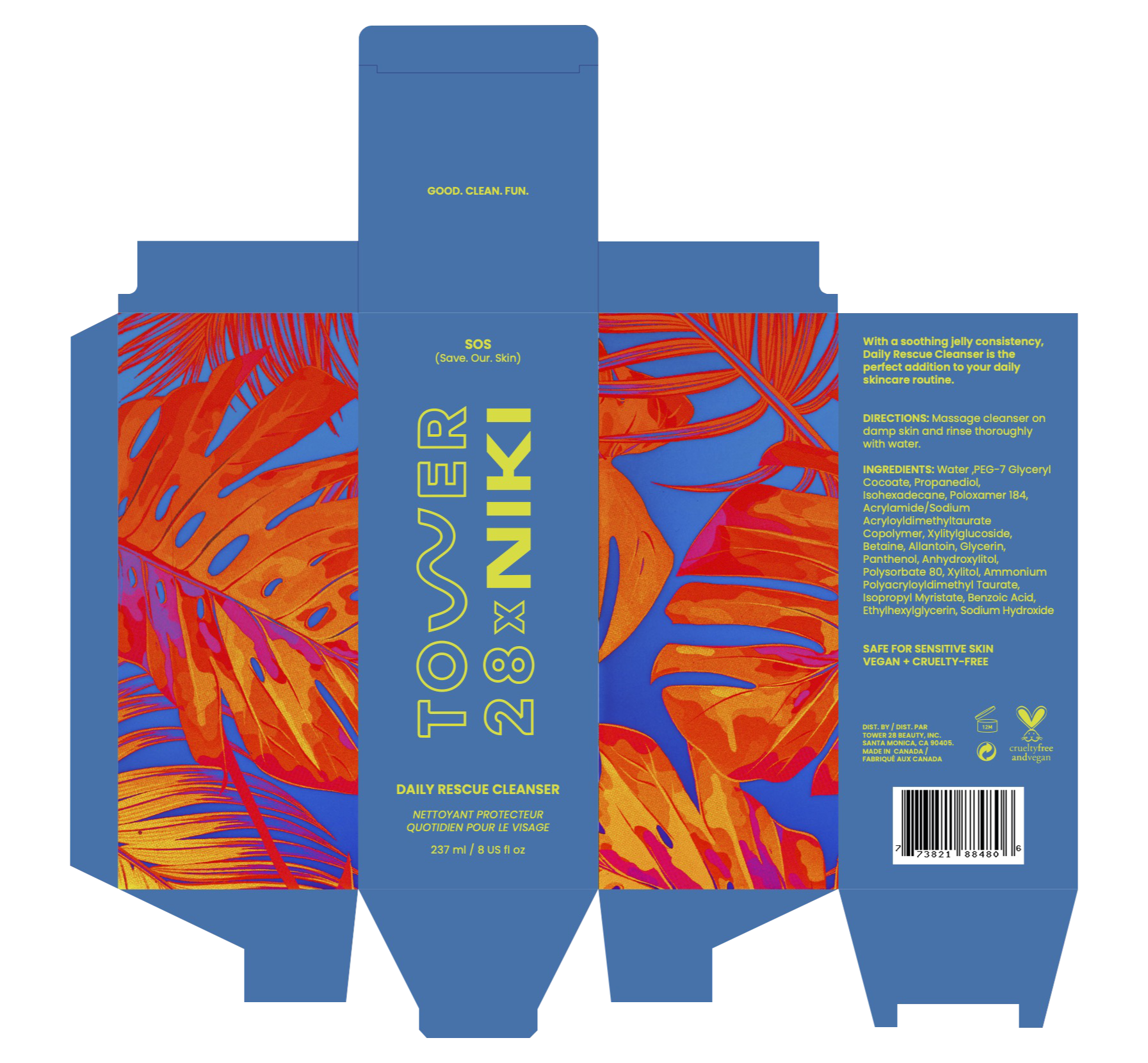
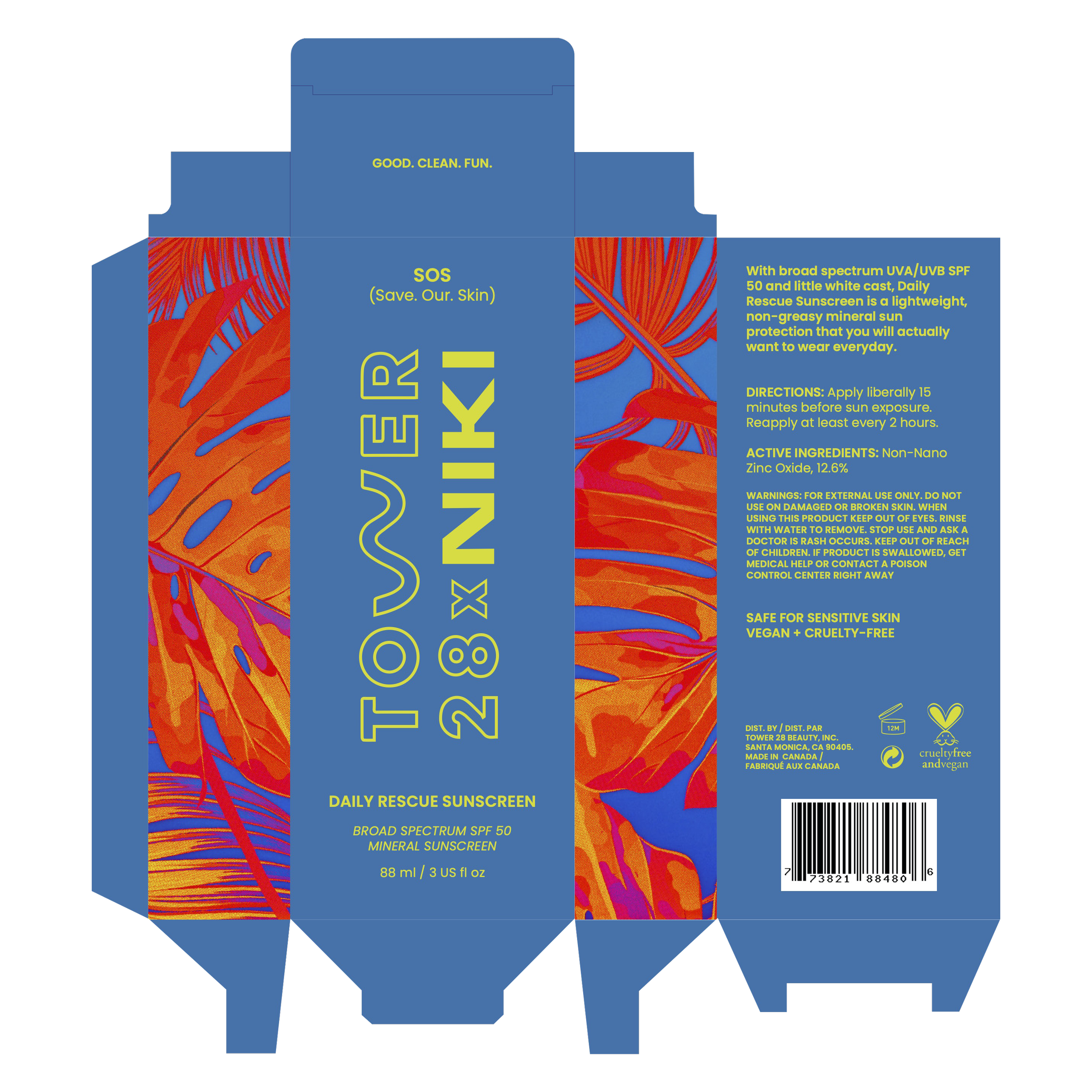
TOWER 28 X NIKI SKINCARE packaging
SCOPE | Packaging Design
THE BRIEF
Redesign an existing brand and extend the identity across a series of products and packages contained within a subscription box for a specific demographic.
SPECIAL EDITION PACKAGING
Tower 28 is a beauty brand that offers clean makeup products as well a select number of sensitive-friendly skincare items. They primarily focus on providing clean products that are sensitive-skin friendly, vegan, and cruelty-free.
Since Tower 28’s current skincare line is quite small, I decided to imagine what a line extension would look like. I paired this idea with a quarterly subscription box model in which packaging designs are based on the seasons at the time of launch.
This particular set of skincare is inspired by the summer season and is also a fictional collaboration with singer-songwriter NIKI . The visual identity speaks to who NIKI is as an artist while maintaining elements of Tower 28’s youthful California spirit.


BOX Packaging Design
Deviating from the pastels and muted tones commonly seen in a lot of skincare packaging today, I opted for a visual direction that is bold and attention grabbing.
Tropical plant imagery coupled with a vibrant color palette are used to evoke spirited emotions associated with energetic summer gatherings.


